
5 website usability mistakes that are costing you advocates and donors
It’s a common stat: you have about 3 seconds to get website visitors to engage or their gone. Of course engagement could mean many things. In this case, let’s define it as “recognizing I’m in the right place to get the information I need and will use your site to complete my task.”
There are things I see organizations doing that are costing them advocates and donations. I’ve done a short review of websites of 3 organizations focused on global development based on these 5 factors. Overall I found a lack of focus, clarity, and urgency in the content. With one exception: ONE.org.
See how you compare to an organization that is getting people involved. And no, you don’t need the backing of a rock superstar to make your website stand out and help you achieve your goals.
1 - Lack of audience definition
Step 1 for any website is to know who your primary audience is. The answer is never “anyone who wants this information we are giving them.” The right answer is a segmented group of people who seek information that you can provide to them. As a visitor to your site, I should be able to recognize that I’m in the right place in those first 3 seconds. I do that by quickly scanning the page I’ve landed on, which is not always the home page.
It is clear that ONE is targeting individuals who want to do something about ending extreme poverty and preventable disease in the world (especially Africa). They know this isn’t everyone in America. However, none of the other sites I looked at had such a clear primary audience. After doing some digging, I could eventually guess, but I would not have recognized myself in those first 3 seconds.
If you have not clearly articulated exactly who you are trying to reach with your website, you’ll spread yourself too thin and not get the attention and action you deserve.
2 - Not focused on top tasks
Yes, that’s right, people come to your site to complete a task. That might be to learn something, purchase something, get contact information, or a multitude of other things. And yes, we're talking about your visitors’ top tasks, not what you want them to do. Sometimes, that might be to donate. Especially if you run a disaster relief program. (I reviewed these sites the day after Hurricane Matthew went through Haiti and the Caribbean. People want to help, so donating is probably a visitor's top task.) In these cases, make sure that it is time sensitive. Even if you are not focused on donations, there are things that your visitors need to do. Make it easy for them to do those things and their overall loyalty and involvement will increase.
ONE is all about action. Visitors want to do something, anything, to help. And they’ve got over 1,000,000 people to do that. How do I know that? They show me the latest stats for Twitter and Facebook followers. Sure, they have a shop where you can buy merchandise that supports the cause, but it’s not their top message.
The other sites put the organization’s desired action front and center, if they put anything there. Mostly, the organizations passively posted information about itself and the work it is doing, leaving the visitor to figure out what to do and how to do it. Don't make people think. They're too busy and distracted for that.
3 - Not connecting content
You cannot rely on your navigation menus to get people around your site. Sure, visitors might start there while trying to complete the task they came to do. But once you’ve got them where they want to go, there are many ways to lead them deeper into your site. Don’t miss the opportunity to gain their empathy and discover more about your mission in ways that are meaningful to them.
ONE has topics for which it advocates. And each one of them has stories tied to those topics. And when you’re in those stories, there are more stories just like it! And photos. And ways to share these stories. And images to share on social media. You get the point. One could spend a lot of time on this site, getting more and more outraged or gaining empathy at each step.
Some of the other sites had case studies that linked to other case studies. But there was a lot of missed opportunities to dynamically connect all of these great stories to garner empathy and create outrage (because, really, that’s what gets people to act; and your cause should make people mad because it is outrageous that so many people live in such abject poverty). And then you need to let them do something about it: Put the form to donate or the Share on Facebook button right there. Not at the top of the page mixed in with a bunch of other content that doesn’t draw attention.
4 - No calls to action
People need to be very specifically invited to do something. When they feel the urge. (See #3.) It may seem rude, but it is not. If someone is on your website, they have already bought into your mission on some level. Lead them on a path to becoming involved. And please don’t make them “click here for more [yawn] information.” Use buttons to have them Sign the Petition, Share on Twitter, Join the Fight, Explore, Dig Deeper.
ONE uses all of those words on its buttons or labels. At the top of the page immediately following some stat or statement that made me angry or shocked. Everyone else: Donate buttons and text links here and there, often just in a menu, along with Calendar or About Us. Sometimes the calls to action were there but not actually linked! You don’t really expect someone to figure out where on your website to “subscribe” to your newsletter, do you? But maybe they would if you told them in just a few words what they’d get if they “joined the list.” What would you do with twice as many email list subscribers?
5 - Not writing for the web
It’s 2016 (and nearly 2017, at that). The web is the primary form of communication. If you are not writing for the web, you will lose your visitors faster than Roadrunner speeds away from Wile E Coyote). No one wants to read a wall of text. People are in a hurry. They have short attention spans (even those of us who are not 35 and under). We are busy, busy, busy. Writing for the web is about starting with your point, having a conversation, and chunking it up your text so it’s easily scannable. (3 seconds, remember!)
On this one, I’m pleased to see most organizations adhere to the basic principles of web writing: short paragraphs, use of headers, chunking text. But few are having conversations with their readers. The language is very organization-centric. “We do this.” “Our goals are to do that.”
ONE focuses on itself only on its About page. Everywhere else it’s about the people it’s helping or the people who have already given their name to the cause. I want to be like those nearly 200,000 people who have signed a petition to provide education to refugees. And I didn’t have to read a paragraph of text to find out how to do that. It is a visual plus a few bits of copy.
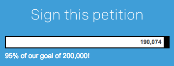
ONE.org's clear and visual representation of what they want to happen.
Oh, and be sure the copy matches the heading. Don’t provide false expectations - or unduly complicate something. Be clear what you are talking about and fulfill the promise. By the way, the search engines love it when you use keywords in headings! (And your keywords should match what people are actually looking for. But that’s for another day.)
What can you do?
If you recognize these things on your own website, STOP! Do not pass GO. Do not collect $200! You’ve got some work to do before you touch your website.
- Define your primary audience – and make the website for them
- Focus on your audience’s top tasks – not what you want them to do
- Connect your content – using metadata and structured content go a long way toward achieving that goal
- Use calls to action – Be explicit and direct
- Write for the web – Go beyond use of headings and short paragraphs; have a conversation with your reader and make it about them and the people you are trying to help
Free website review
Want a review of your website? We're offering free reviews for non-profits or NGOs based on the factors listed here. What have you got to lose?